Book Cover Redesign
If you’ve been following along, you know that I have officially relaunched one of my very first books, Breaking the Surface. I bill it as High School Musical meets Finding Nemo … during a global warming crisis (and without singing).
This redesign has been quite the undertaking (both of my time and money), but now that I know more, I can do better and I wanted to. I really, really wanted to. The most important part of this project was polishing up the interior of the book, specifically, having the text copy edited. But another huge portion was a cover redesign. Today I’m going let you behind the scenes and walk you through that process.
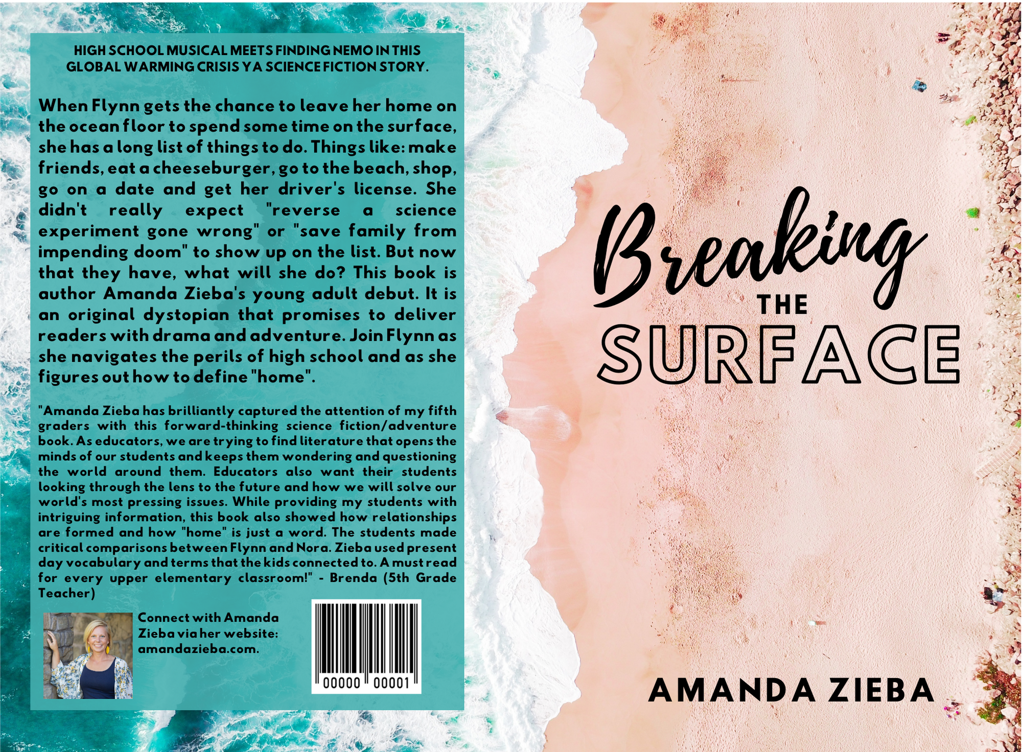
When I first started self-publishing books, I knew enough to get my books out into the world, but not a whole lot more. Thus, I used the most basic tool for creating a cover: The Kindle Direct Press Cover Creator Tool. Through it, self-publishers can pick from a dozen different designs and then insert their cover image of choice as well as select a font and color for the text. Back in 2013 when I was putting out Breaking the Surface, most of the designs were preset, so the font pairings and colors were pre-selected and you could only choose from the options available.
Now, there’s a bit more choice involved, but still, it’s a bit limited. The result is that covers created through KDP’s Cover Creator are easily recognizable as such and are a sure fire way to call yourself out as a beginner. This is one of many reasons why I knew I HAD to change my cover. Since we’re starting this journey back at the beginning and for my final reveal to have the best possible wow factor at the end, you need to see where I started. Using KDP’s Cover Creator Tool, here is the original cover for Breaking the Surface.
It’s not terrible, but it doesn’t exactly scream TEEN ADVENTURE STORY the way I want it to. So, back to the drawing board (or digital design tools in this case). At first I thought I’d redesign the cover myself. I have designed most of my book covers. It is a process I enjoy and the ones I’ve done so far have turned out pretty good (at least, I think so!). Here is an attempt using Canva.
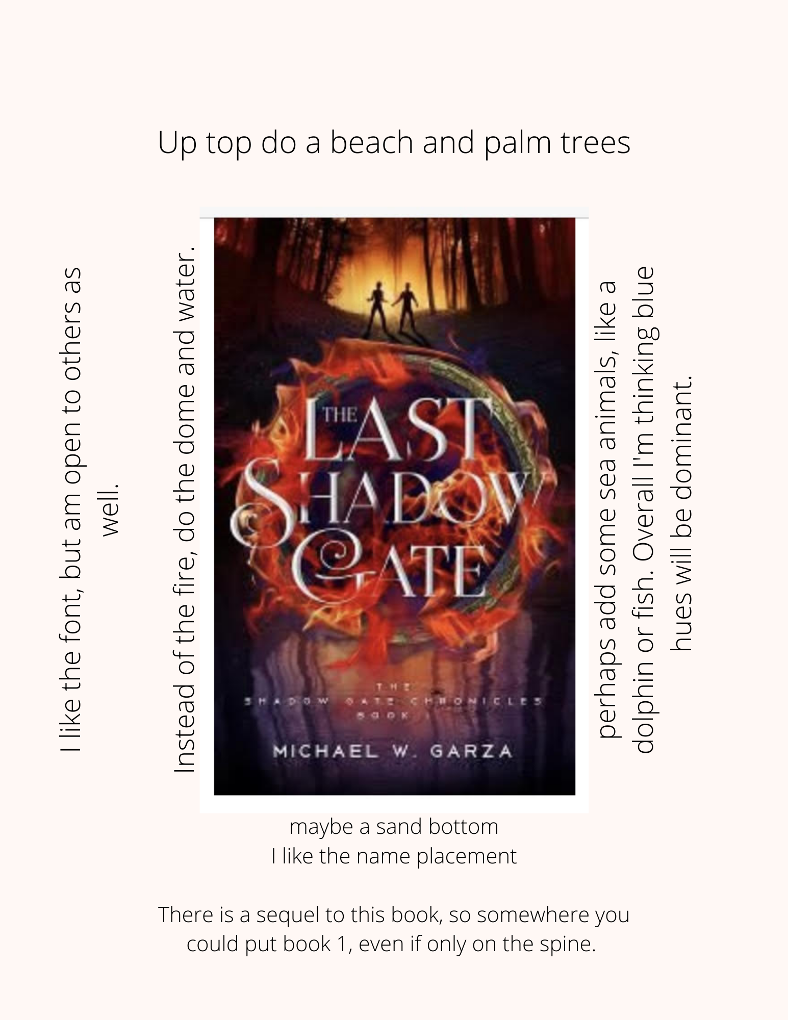
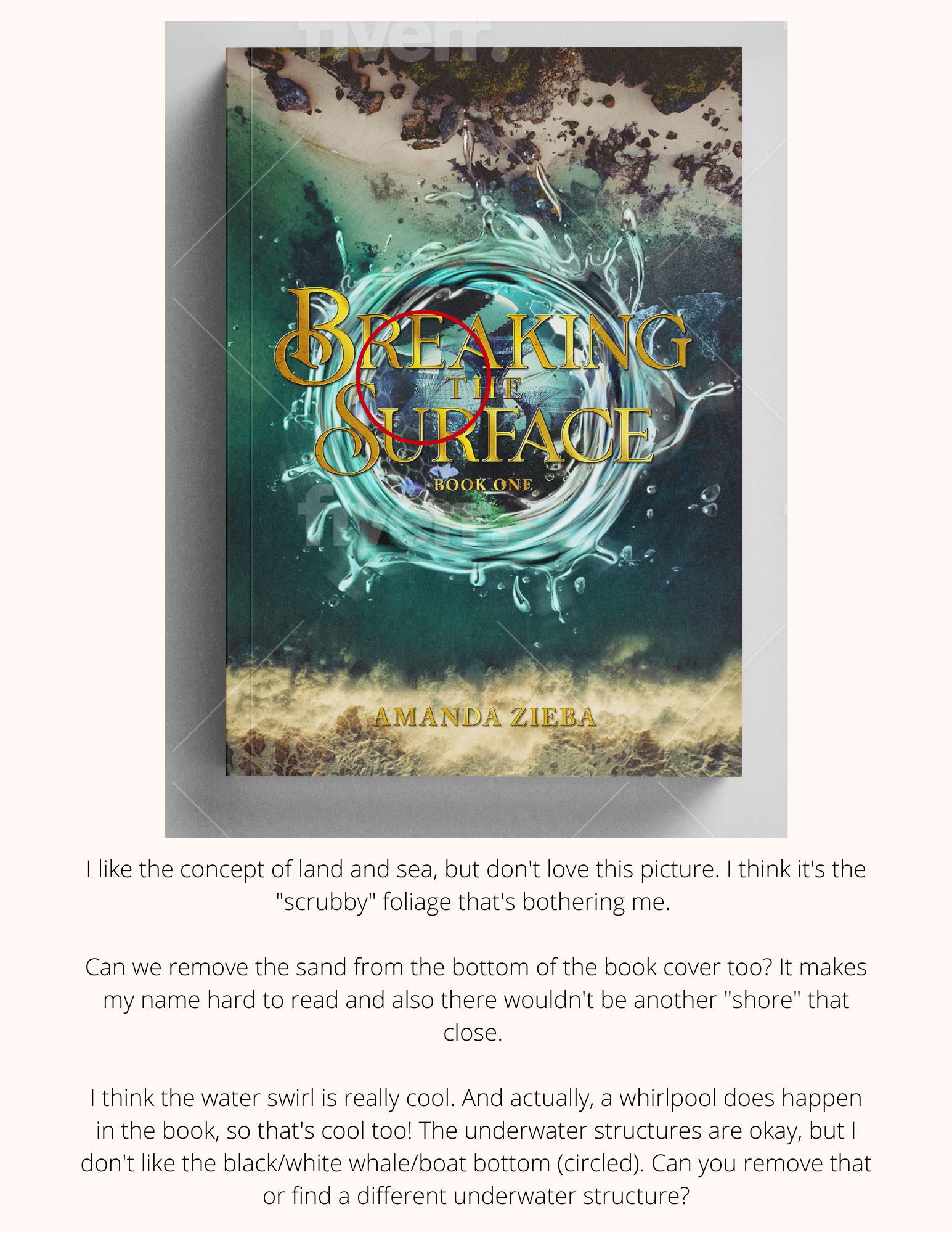
This was better, but still wasn’t what I thought would grab the attention of my ideal reader: a young adult who loves Disney Channel sitcoms and original movies. So, I decided to hire a professional through fiverr, a freelance marketplace for creatives. On the site, I found Alex, a Canadian designer. After telling her about my book, including the blub and genre, she sent me several “inspiration” book covers. (Do you ever watch those HGTV home reno shows? This is kind of like the part when the designers take the home owners to an already finished house to look at flooring, backsplash and color pallets to help them decide what materials they’d like to pick for their project.) Here is the inspiration image I picked, along with the notes I sent back to Alex.
Alex took this information and designed two initial cover styles for me to pick from.
Which one would you choose?
Navy blue and gold are two of my favorite colors, so it was hard not to gravitate to the first cover you see. However, I loved the concept of both land and sea in the second book cover. This idea of being torn between the two is a big part of the book. But I didn’t love the “scrubby bushes” on the top and my name blended in too much on the bottom. Still, I thought that one had more potential.
Once I selected my preferred style (option #2) , Alex and I worked together, going back and forth to make it perfect. I shared these notes and Alex came back with this design.
We went back and forth a couple more times.
I told Alex, “Can you add some texture to the image of the girl? Right now she feels too “flat” to me. But I love the addition of her and the concept that she is on the edge of the water. So great! Finally, I like that you can read the title so much better but am not sure on its coloring right now!”
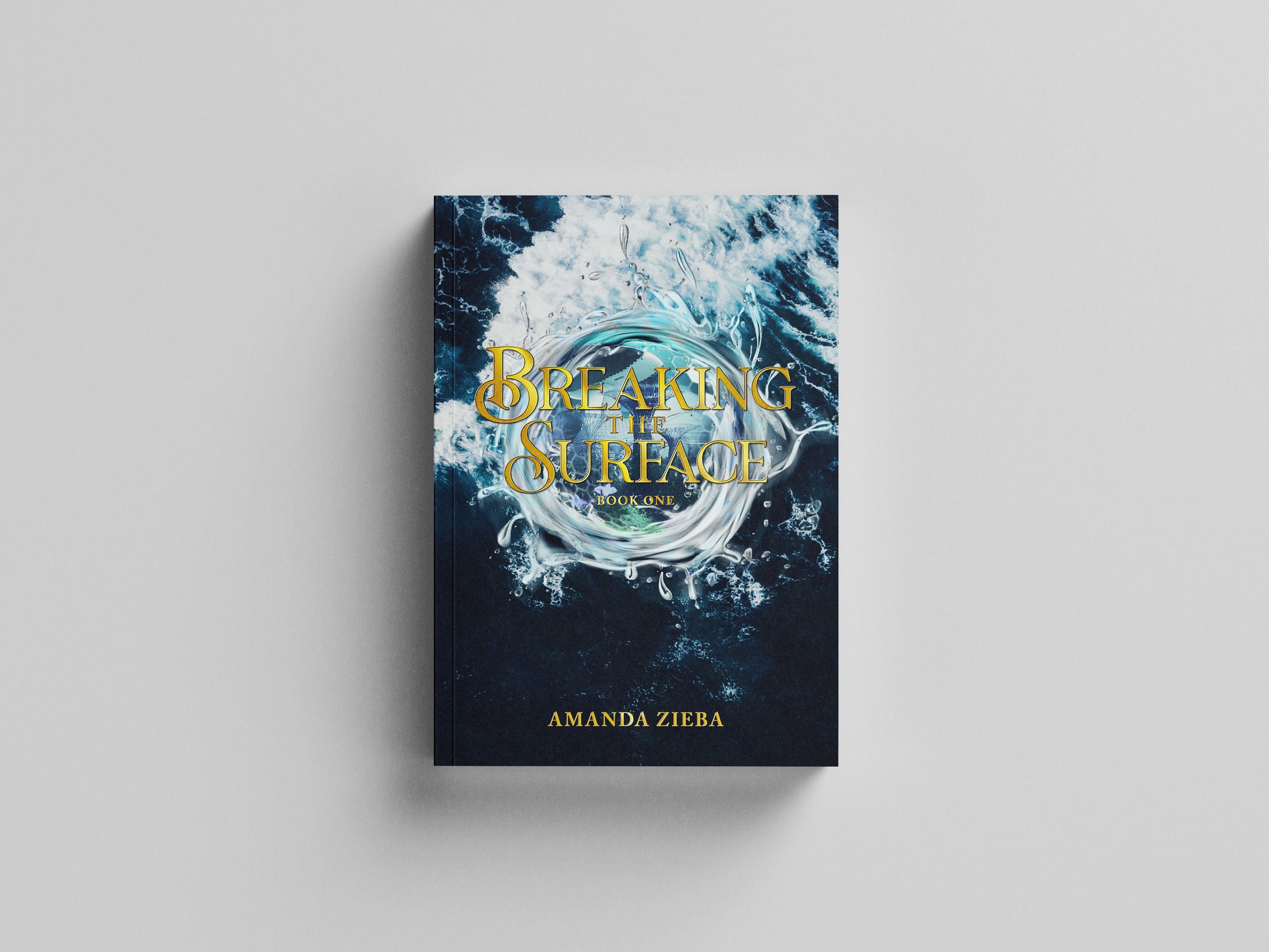
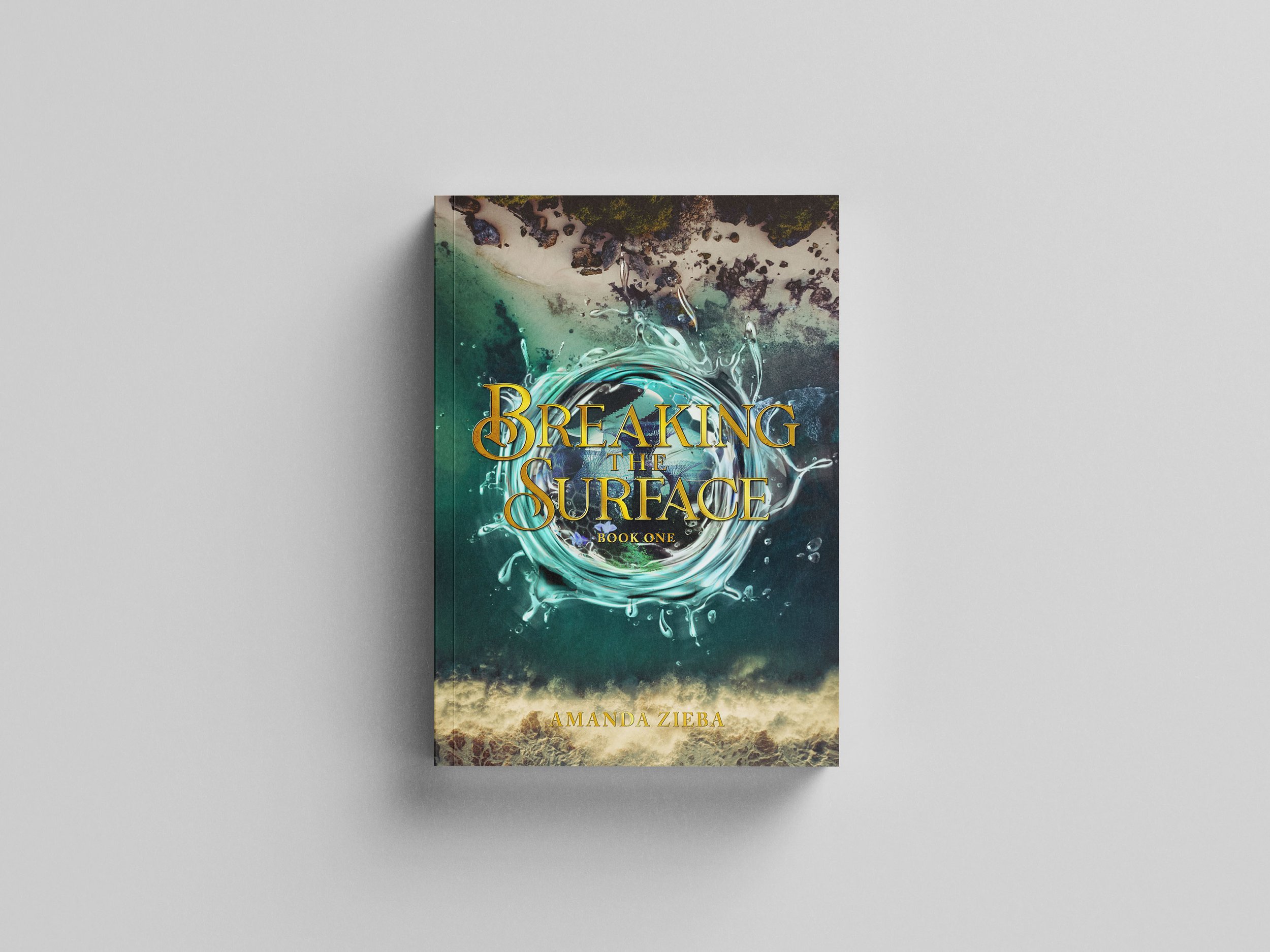
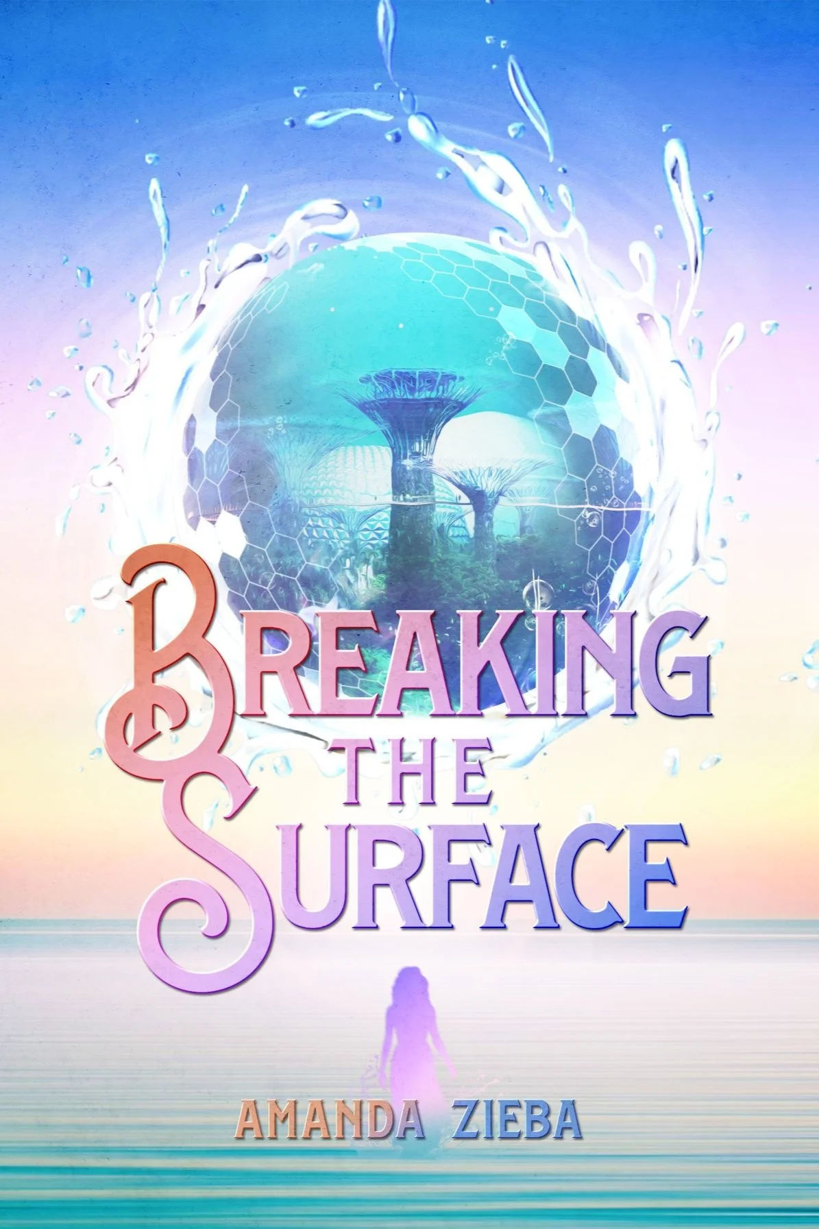
And then, she did it. Alex created the perfect cover for my underwater adventure story. Ta-da! Here is the final, new-and-improved, cover for my redesigned and relaunched book, Breaking the Surface.
There are so many things about it I love. But chief among them are the fancy font, the way Flynn is standing on land but turning back to look at the ocean, the water swirl with the underwater city inside. SO much of the book is captured in this design. I am positive that this book will reach new readers, the right readers. What do you think? How’d we do?
Thank you Alex for lending your creativity and talent to my book!
If you are looking for an adventurous read for a teenager in your life (probably more appealing to girls…) I’d love for you to purchase and share a copy of Breaking the Surface with them. They are available on Amazon and direct through my website (these come with a personalized autograph!).
For the self-publishers in the crowd, I hope that seeing my cover redesign process was helpful and that you’ll be able to take some of this information into a project of your own. If you have any questions, drop them in the comment section below or head to the WordNerdopolis Post Office and send me and email. Or check out the additional blog posts and videos on this topic below.
If you liked this post, you might also enjoy…
This post was made beautiful by Canva.
If you liked what you read on my blog today (or are in search of weekly word nerd goodness) and would like to have it delivered to your inbox every Wednesday morning, you can sign up HERE. If you are interested in any of my email lists (with free goodies/downloads!) click the audience that best describes you: Writer. Teacher. Reader. As always, feel free to share this post with others you think might be interested via email, Facebook or Pinterest.
Finally, affiliate marketing is promoting a product or service in return for a commission. When you purchase a product or service through one of my links, I earn a small part of the sale. There is NEVER any extra cost to you. If you looked up the same product on the same site through another source besides my website, the price will still be exactly the same. 100% of the time.
I also NEVER link to products or services that I don't 100% believe in. I will never tout a company or their goods if they are disreputable or if I don't believe them to be worthy of your hard-earned money. In no way are my affiliate links a scam. (Language borrowed with permission from Kristen Kieffer on Well-Storied.com)
